


In today’s digital landscape, a company’s brand is rarely experienced in just one place. From its website and social media channels to marketing materials, presentations, and internal communications, every platform contributes to how people perceive the business.
Yes, each channel serves a different purpose, but at the same time, they should all feel like they belong to the same brand. Consistency is important, and having a cohesive visual identity does more than make a company look professional; it builds recognition, communicates a clear message, and creates a seamless experience for consumers when interacting with the company.

Here’s what happens when your brand looks different everywhere
You’re scrolling through a company’s website and finding a clean, minimalistic design. Then, you decide to check out their social media pages, and it looks entirely different. The colours are different; the overall tone seems to belong to a completely different business; and, worst of all, the photography used is different from their website.
Individually, each platform might look perfectly fine, but together, they tell a confusing story.
When visual styles vary too much across platforms, it can create the impression that a company lacks a clear brand direction. Consumers may struggle to understand what the business stands for, who it is trying to reach, or what makes it distinctive.
Will it be an issue over time?
The answer is simple: yes.
Over time, this inconsistency can weaken brand recognition. A strong brand should be recognisable even when its logo is not immediately visible. Consistent colours, typography, designs, and, most importantly, imagery must help create familiarity. If not prioritised, it becomes harder for audiences to connect the dots.
Consistency does not mean every platform needs to look identical, but it should maintain a shared visual direction while allowing enough flexibility for each platform to serve its purpose.
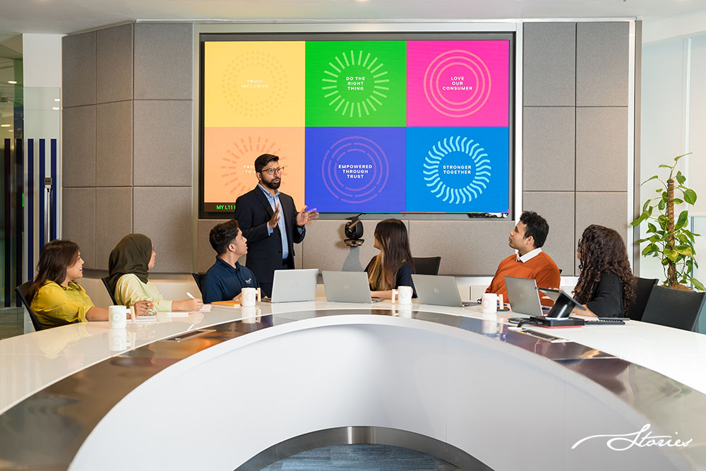
Here are some samples of lifestyle stock photos that we took for British American Tobacco. Wherever possible, we incorporated their brand colours and taglines into the background.

Clear direction will make everyone’s job easier
While having a clear direction will help consumers know your story and where you stand in the industry, there’s one other benefit: it will make your team’s job a lot easier.
Without a clear visual direction, teams often end up making design decisions from scratch. They’ll spend time searching for suitable photographs or determining whether an image fits the brand. Then, different departments may develop their own interpretations of the company’s visual identity, resulting in more inconsistency.
Here’s a solution
A planned image library can help solve this problem.
Building a central collection of approved photographs or portraits can help companies give their teams a reliable starting point. Instead of searching through old folders or sourcing new images every time a project comes up, employees can access visuals that have already been selected with a brand in mind.
This makes everyday work more efficient and reduces unnecessary duplication, such as arranging new photoshoots when suitable images already exist.

Of course, having a library of images is only part of the solution. Companies also need a clear visual direction and practical guidelines on how the assets should be used.
These guidelines do not have to be complicated—just to figure out preferred photography style, image composition, lighting, portrait backgrounds, and the types of images that best represent the company. They can also explain where certain assets should be used, how images should be cropped, and which visual approaches to avoid.
For example, if a company wants to look approachable and people-focused, its photography should reflect that intention.

Why authenticity still matters in the age of AI
AI-generated imagery is becoming increasingly accessible; it can be tempting to use it as a quick solution for filling gaps in a visual library. While AI can be useful for certain creative applications, it is worth considering whether it accurately represents the company and its people.
This is particularly important when it comes to photography.
A company’s employees are real people, and audiences increasingly value seeing people behind a business. Generic or AI-generated faces may make you feel less trustworthy, disconnect from the culture, lose authenticity, and fail to showcase the brand’s people.
In conversations with our clients, authenticity is often a key consideration. They want portraits that genuinely represent their teams, not images that simply look good. This is a reminder that effective brand photography is not only about aesthetics, but also about credibility, connection, and telling an honest story.
Ultimately, consistency is about creating a recognisable and trustworthy experience. Your brand does not need to look exactly the same everywhere, but it needs to feel like the same brand everywhere.